Building a brand as warm and enduring as the homes it sells — from naming to digital presence, every touchpoint crafted for trust and aspiration.
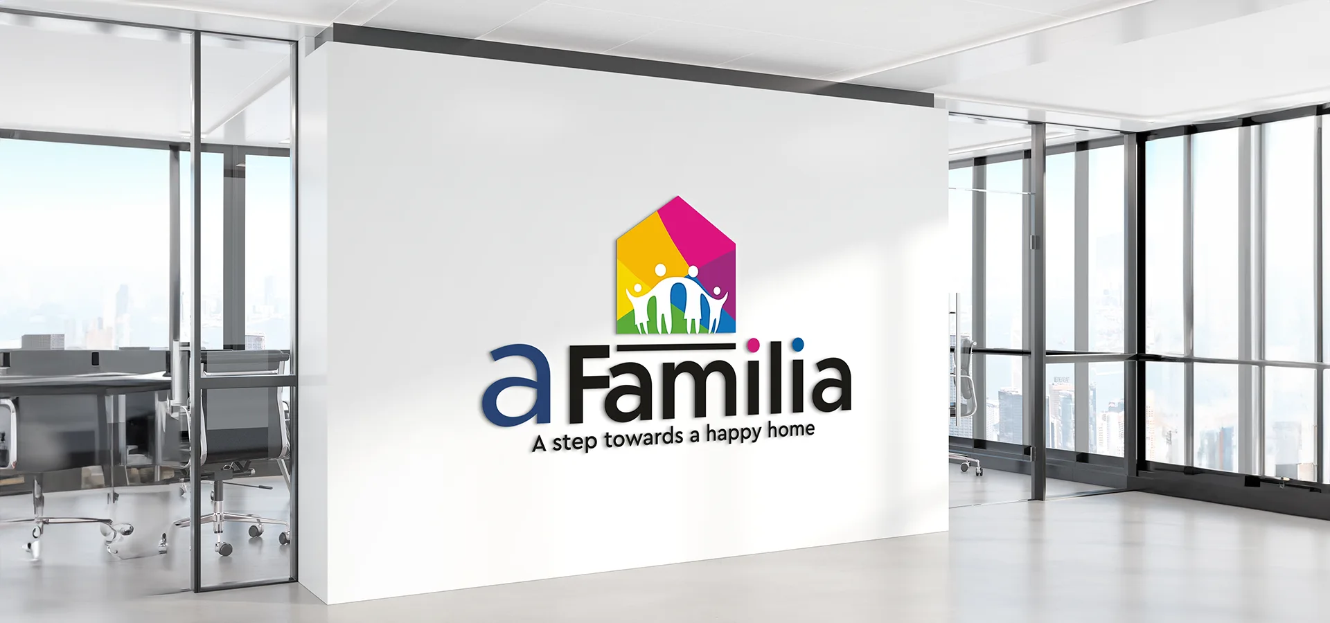
A Familia is a premium residential real estate development built around the idea of family, belonging, and legacy. The developer came to us with a vision, a project that would stand apart from the typical builder aesthetic and needed an identity system strong enough to carry that vision from a construction hoarding to a buyer's inbox.
A new residential project entering a crowded market needed more than a name, it needed a soul. The developer wanted buyers to feel belonging before they'd even seen a brick. We had to build a brand identity from scratch that could carry warmth, trust, and aspiration across every touchpoint from a construction hoarding to a buyer's first click.
Rooted in the universal idea of family, became both the anchor and the creative brief. Everything we designed had to feel like it earned that name.
We were engaged across seven distinct workstreams, each building on the last to create a cohesive brand world.
From strategy to project site and marketing the project across all traditional and modern digital platforms.
We explored the project's core values, family, warmth, legacy, community and evaluated names that could carry emotional resonance while remaining distinctive in the market. A Familia emerged as the unanimous choice for its cross-cultural appeal and emotional depth.
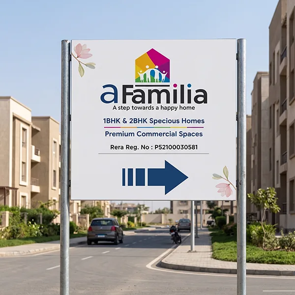
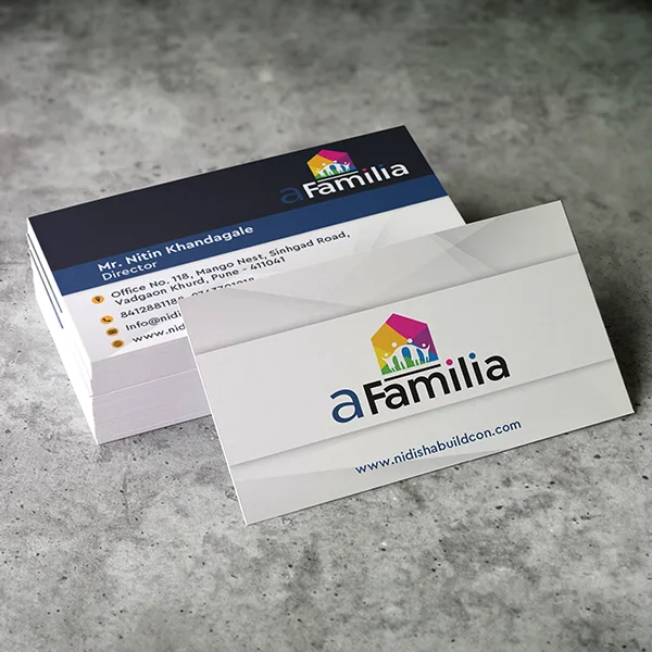
The logo was designed to reflect both modern architecture and the organic warmth of a family home. Clean geometric forms, a considered typographic treatment, and a palette of earthy tones and rich warmth give A Familia a mark that works equally well on signage and a mobile screen.
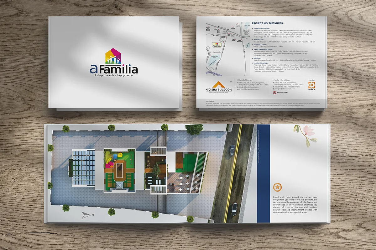
We designed a suite of sales brochures that balance lifestyle aspiration with factual clarity, floor plans, amenity highlights, and investment rationale presented in a format buyers want to hold on to.
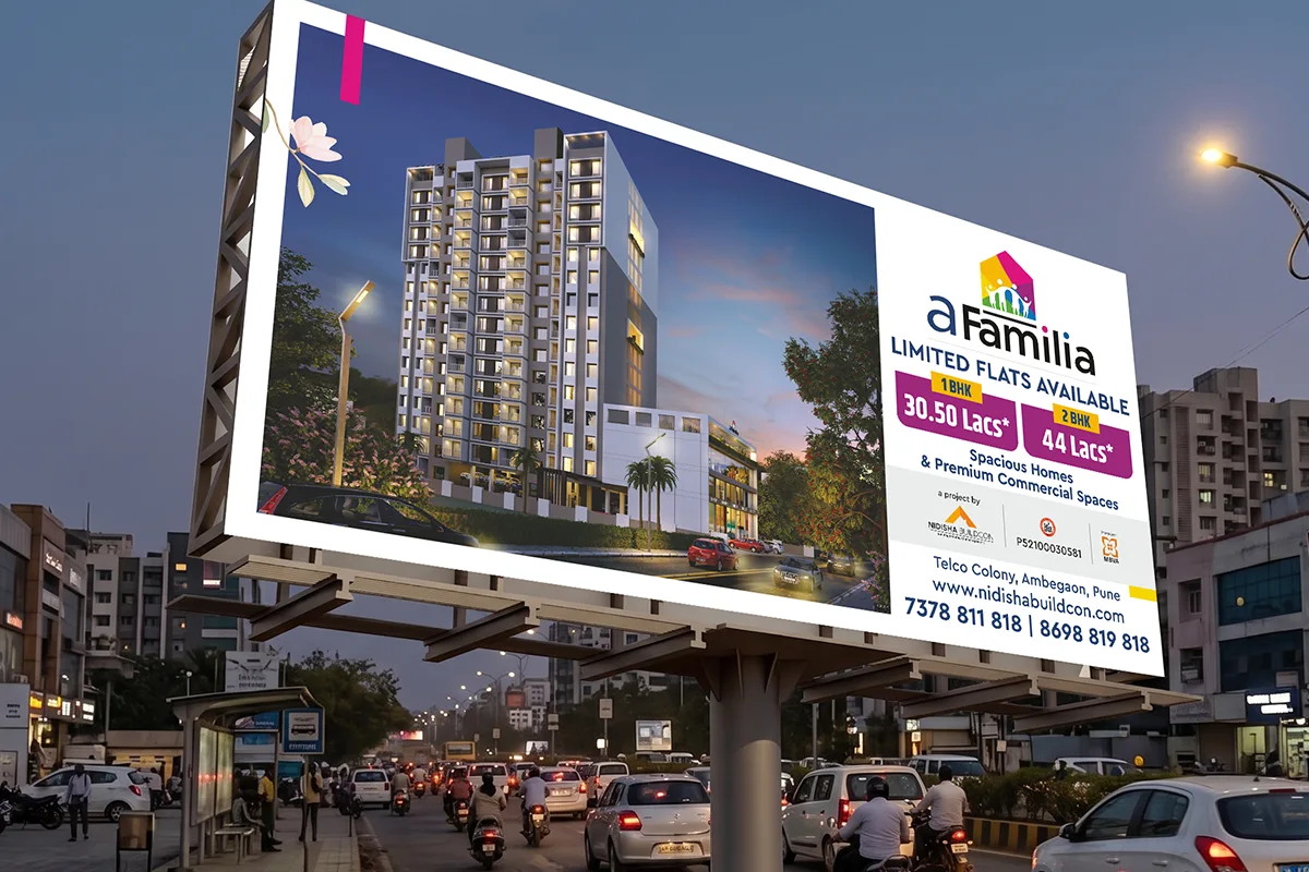
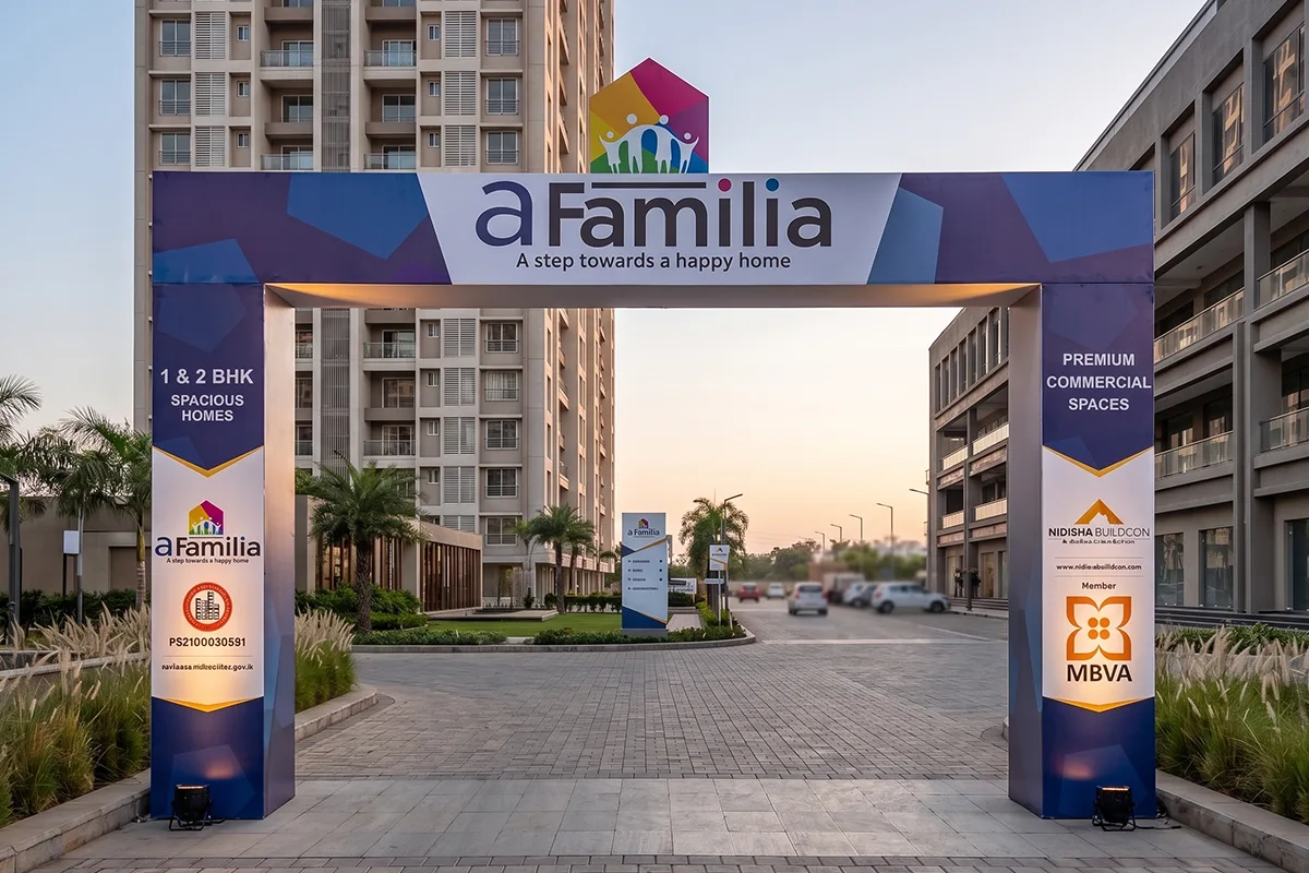
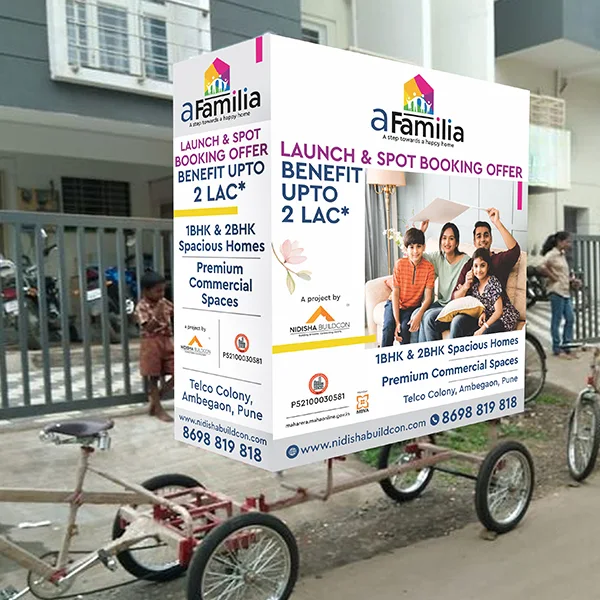
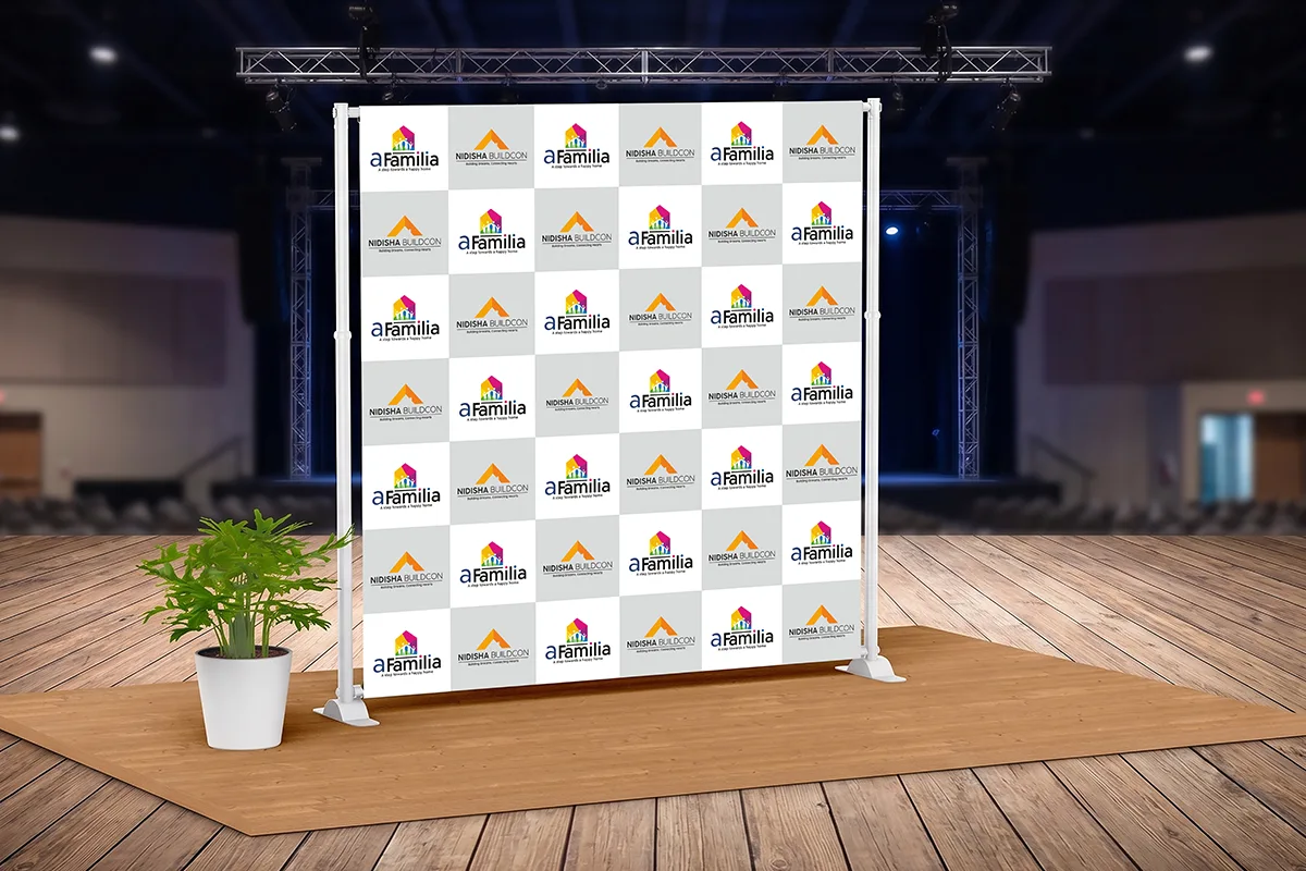
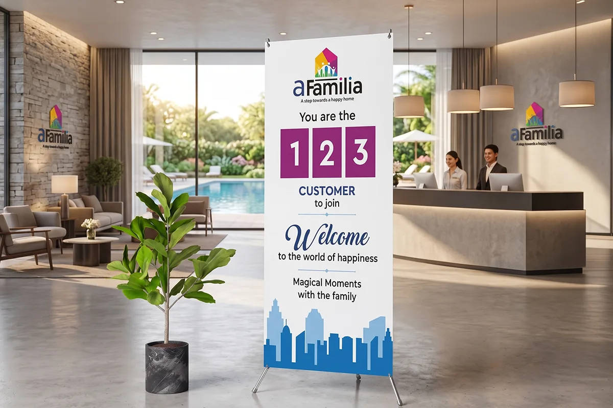
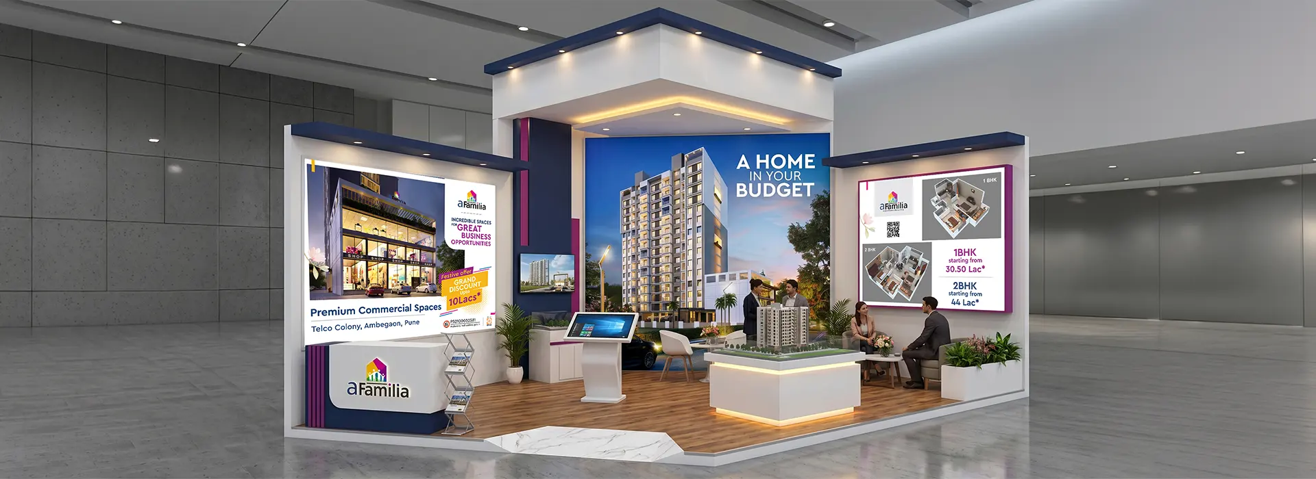
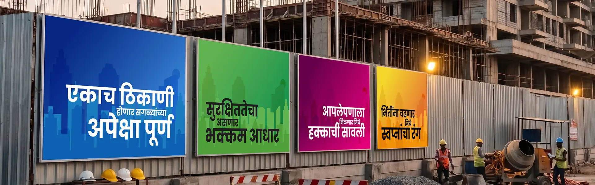
The construction site became a brand touchpoint. Hoardings, entry gates, safety signage, and site office graphics were all aligned to the brand identity, turning an active construction site into a preview of the finished vision.
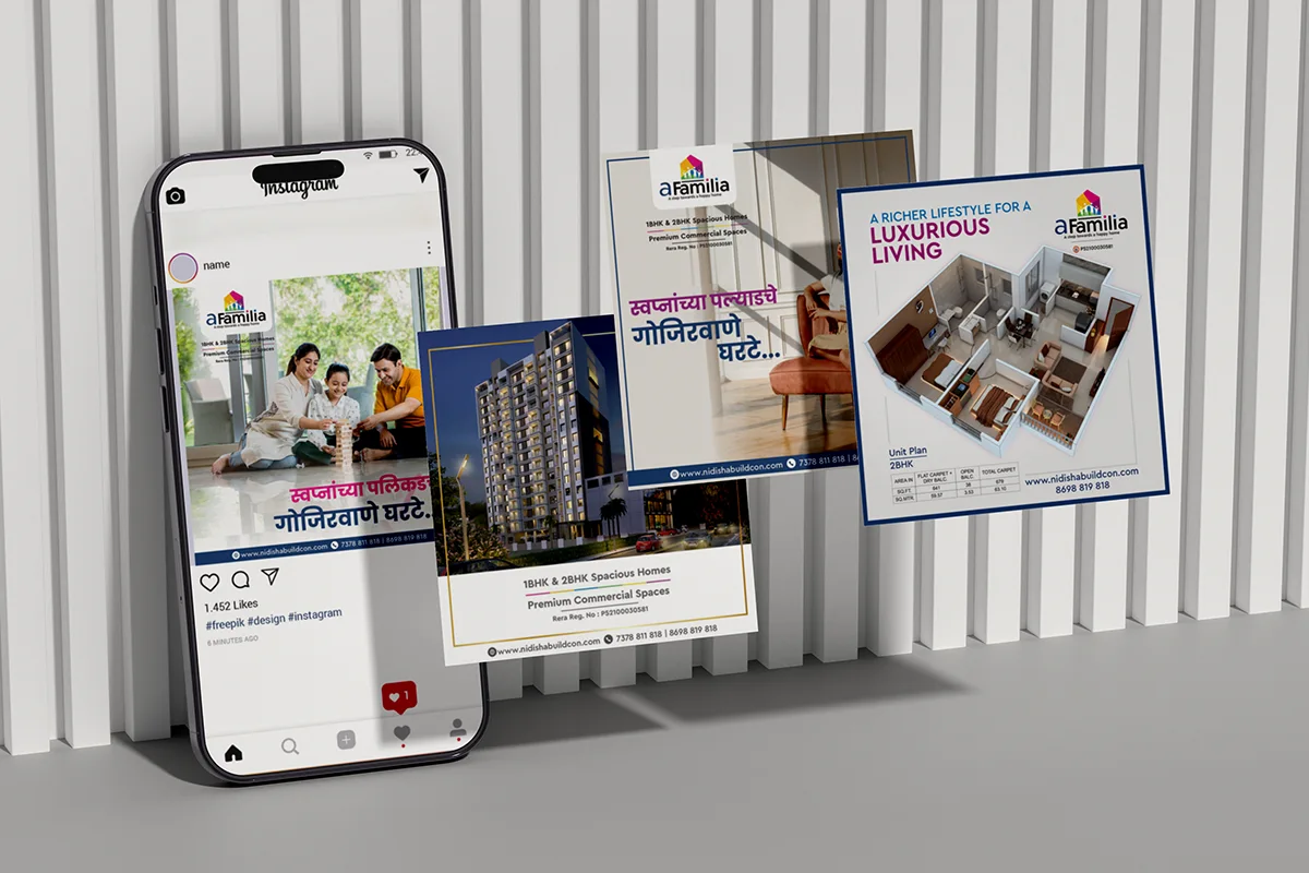
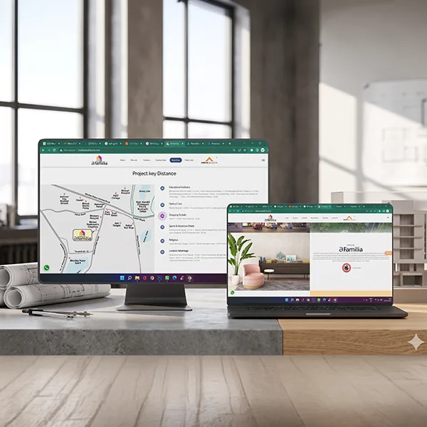
We designed and built a project-specific website that served both as a lead capture engine and a brand story platform with virtual walkthroughs, floor plan downloads, a contact form, and a gallery. Designed mobile-first, with conversions baked into the UX.
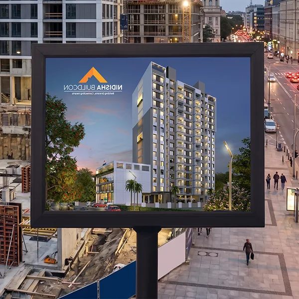
A campaign framework covering Meta, Google, and outdoor hoardings. Creative assets, from thumb-stopping reels to large-format billboard designs were built from the same visual system, ensuring consistency whether seen on a phone or from a highway.
A Familia launched to strong market reception. The cohesive identity helped build buyer confidence before a single unit was sold, and the digital campaign generated qualified leads from day one.
What's my style is not your style and I don't see how you can define it. It's something that expresses who you are in your own way. What's my style is not your style and I don't see how you can define it. It's something that expresses who you are in your own way.
Explore our impactful case studies and projects showcasing real results and proven success.