For generations, Athavale's has been synonymous with authentic Maharashtrian taste, premium ingredients, and traditional recipes that evoke nostalgia with every bite. With a strong reputation in India and a growing customer base abroad, the brand needed packaging and communication that reflected the same trust, quality, and appetite appeal that customers experience when they open the pack. That is where Trimitiy Studios Pvt. Ltd. came in.
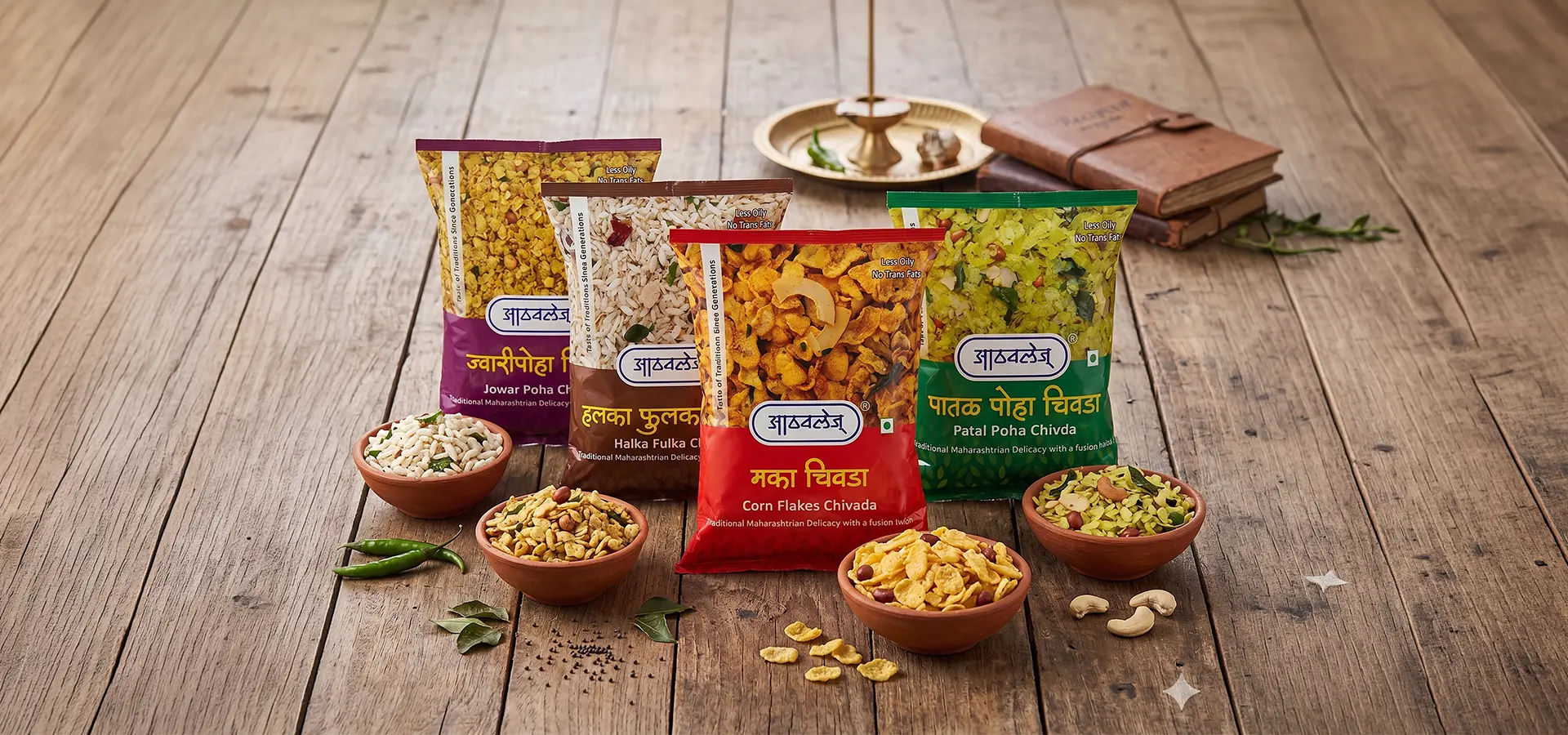
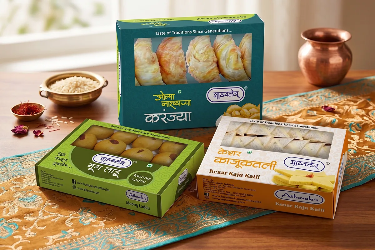
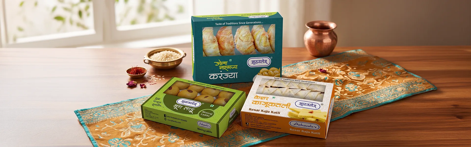
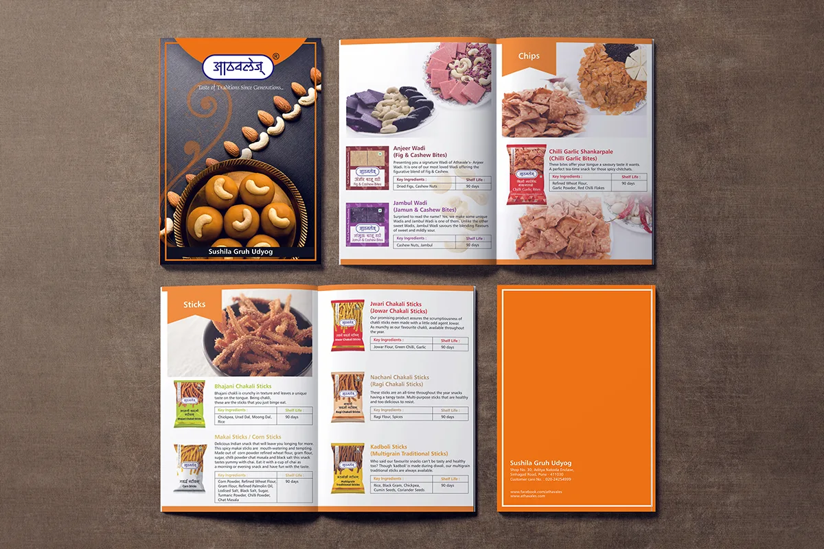
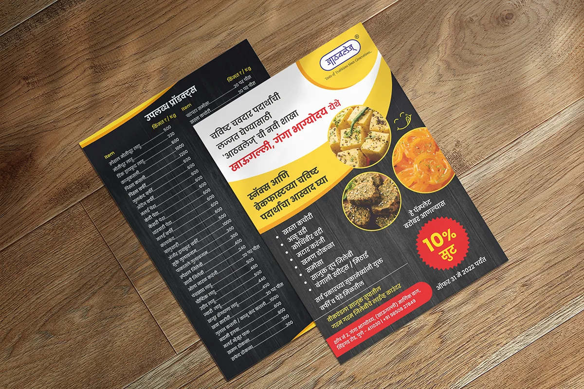
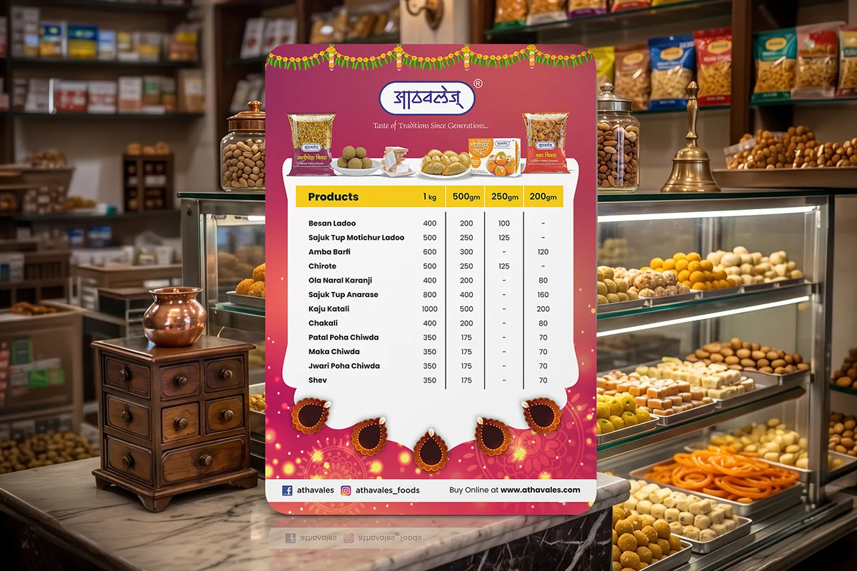
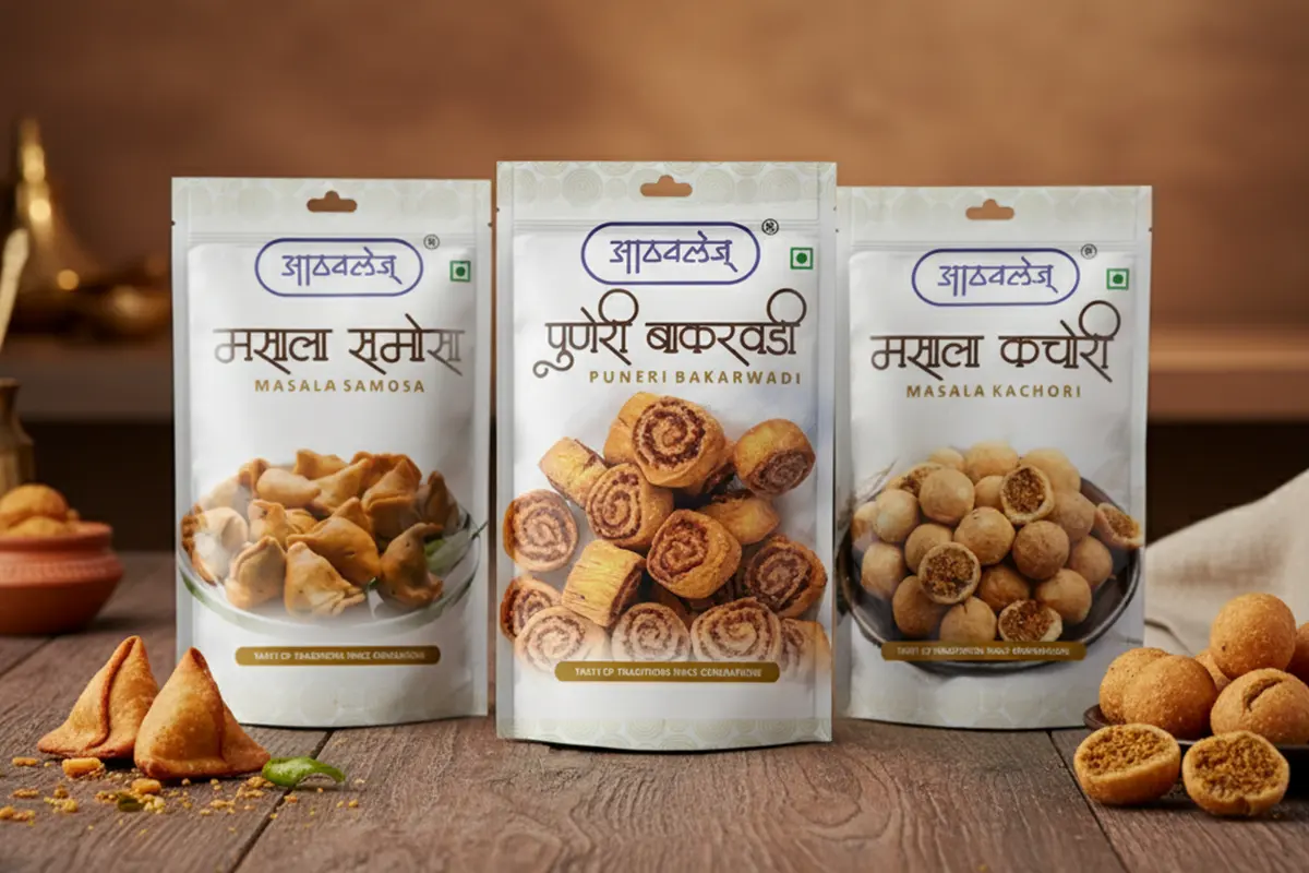
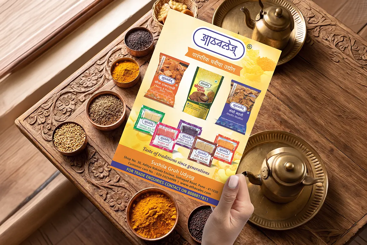
Athavale's offered a wide range of traditional snack products, making it essential to maintain consistency while giving each SKU its own identity. The packaging needed to stand out in a highly competitive retail environment and instantly communicate taste, freshness, and trust. Additionally, the design had to appeal to both long-time loyal customers and modern consumers in India and international markets.
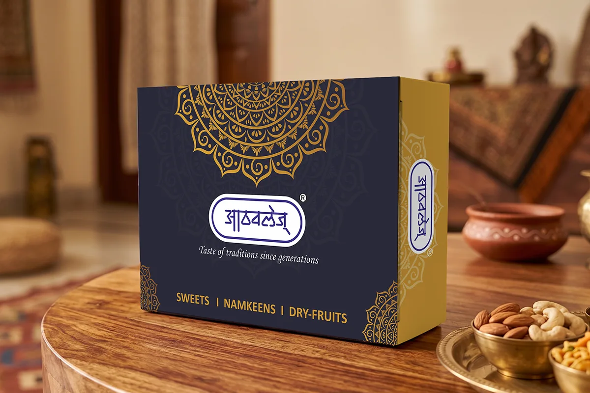
To create a visually appetizing packaging system that encourages consumers to pick up the product at first glance. To establish a strong and consistent brand presence while preserving Athavale's heritage and authenticity. To develop a scalable design language that seamlessly extends across packaging, marketing materials, and social media communication.
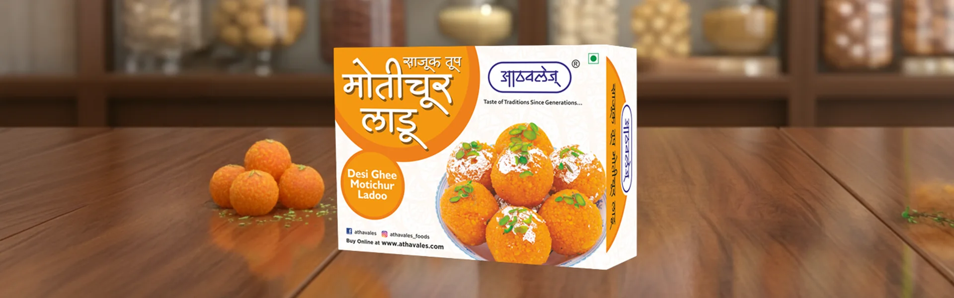
Food packaging succeeds when it creates cravings.
We carefully studied consumer buying behavior and understood that purchasing decisions for snack products are often emotional and impulsive. Therefore, every visual element was designed to enhance appetite appeal.
The objective was simple. When consumers see the pack, they should imagine the taste before they even open it.
Consumers are exposed to dozens of competing products within a few seconds. To ensure Athavale's products stood out, we developed a packaging system that balanced traditional authenticity with modern visual impact. The result was a packaging family that looked unified while allowing every product to maintain its own unique personality.
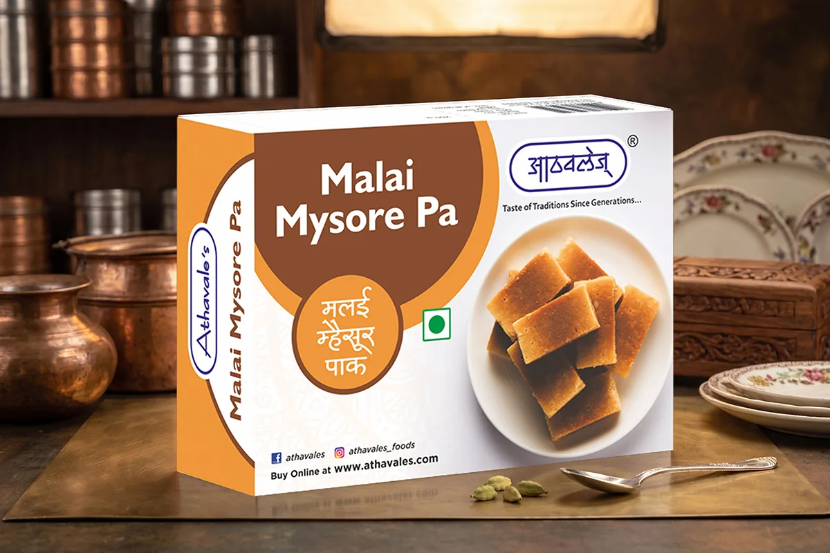
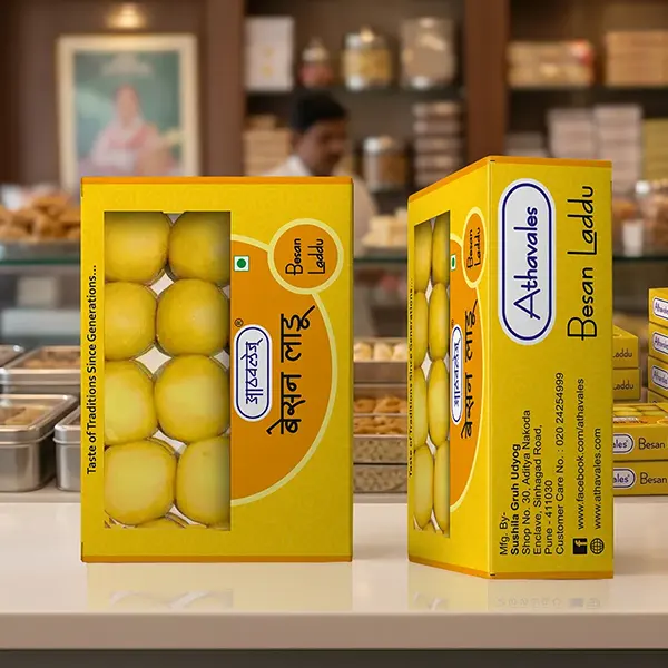
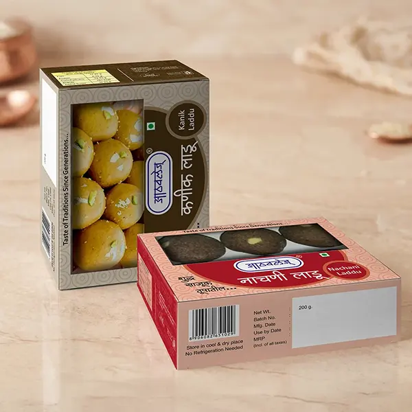
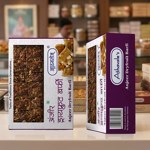
Rather than chasing short-term design trends, we focused on creating a visual identity that respected the brand's legacy while making it relevant for modern consumers. The design language celebrated Indian food culture, trust, craftsmanship, and homemade goodness—qualities that have made Athavale's a beloved name among generations of customers.
A strong packaging design should not stop at the shelf.
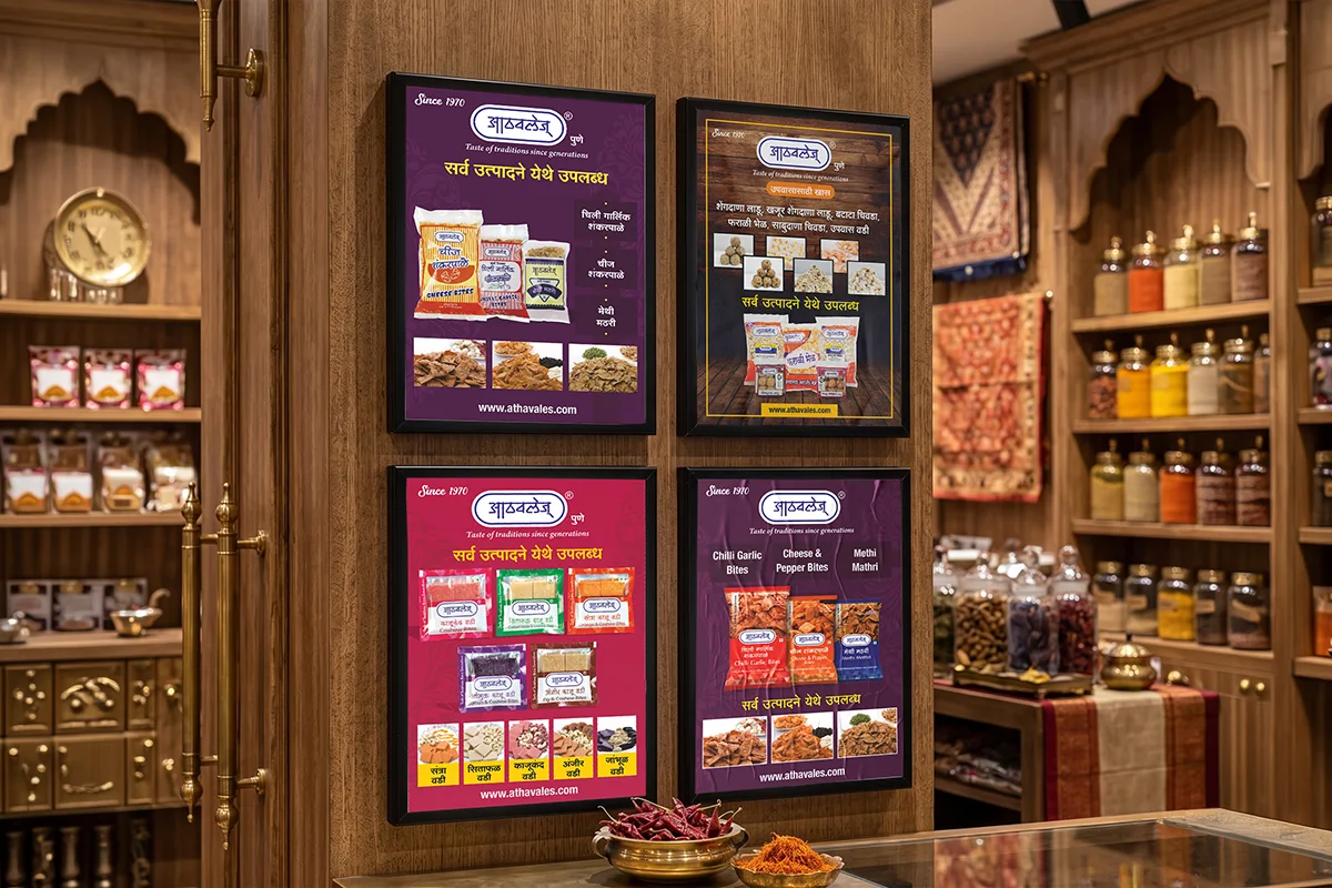
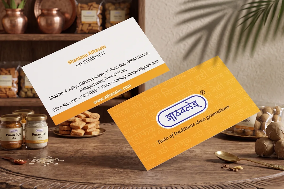
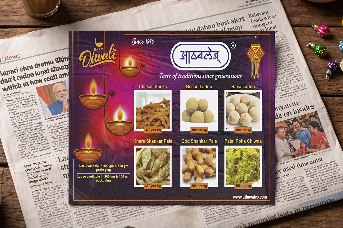
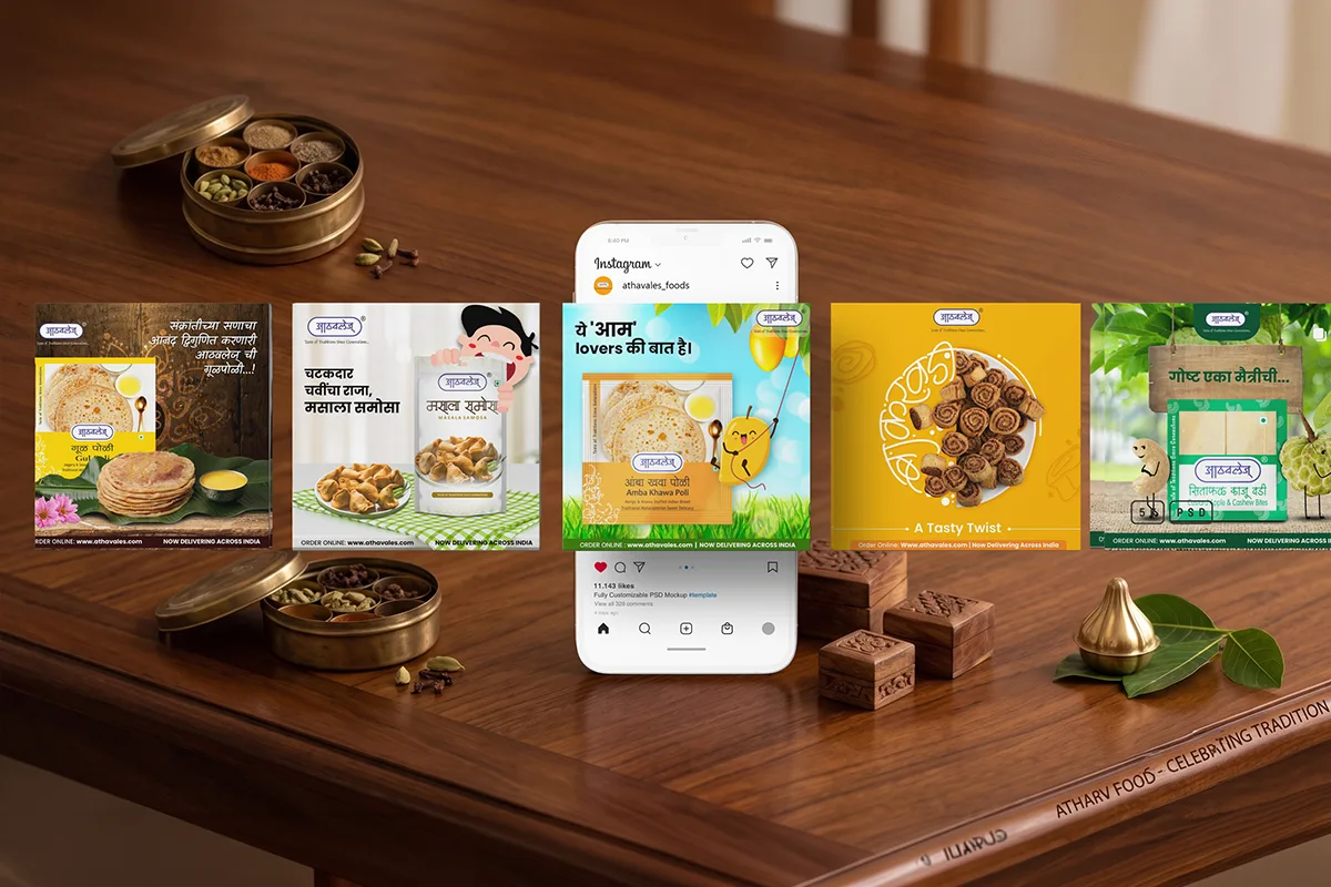
To strengthen Athavale's digital presence, we extended the visual identity into social media communication. Product-focused creatives, festive campaigns, promotional posts, and engagement content were developed using the same visual language established through packaging.
This created a cohesive brand experience across both physical and digital touchpoints.
For Athavale's, our focus was not simply on making the products look good, it was on making them impossible to ignore.
Explore our impactful case studies and projects showcasing real results and proven success.